The look of cute rock
Pink is just one color. A proper visual system is built on the clash between the cute, the everyday, the cheap, the personal, and the slightly broken.
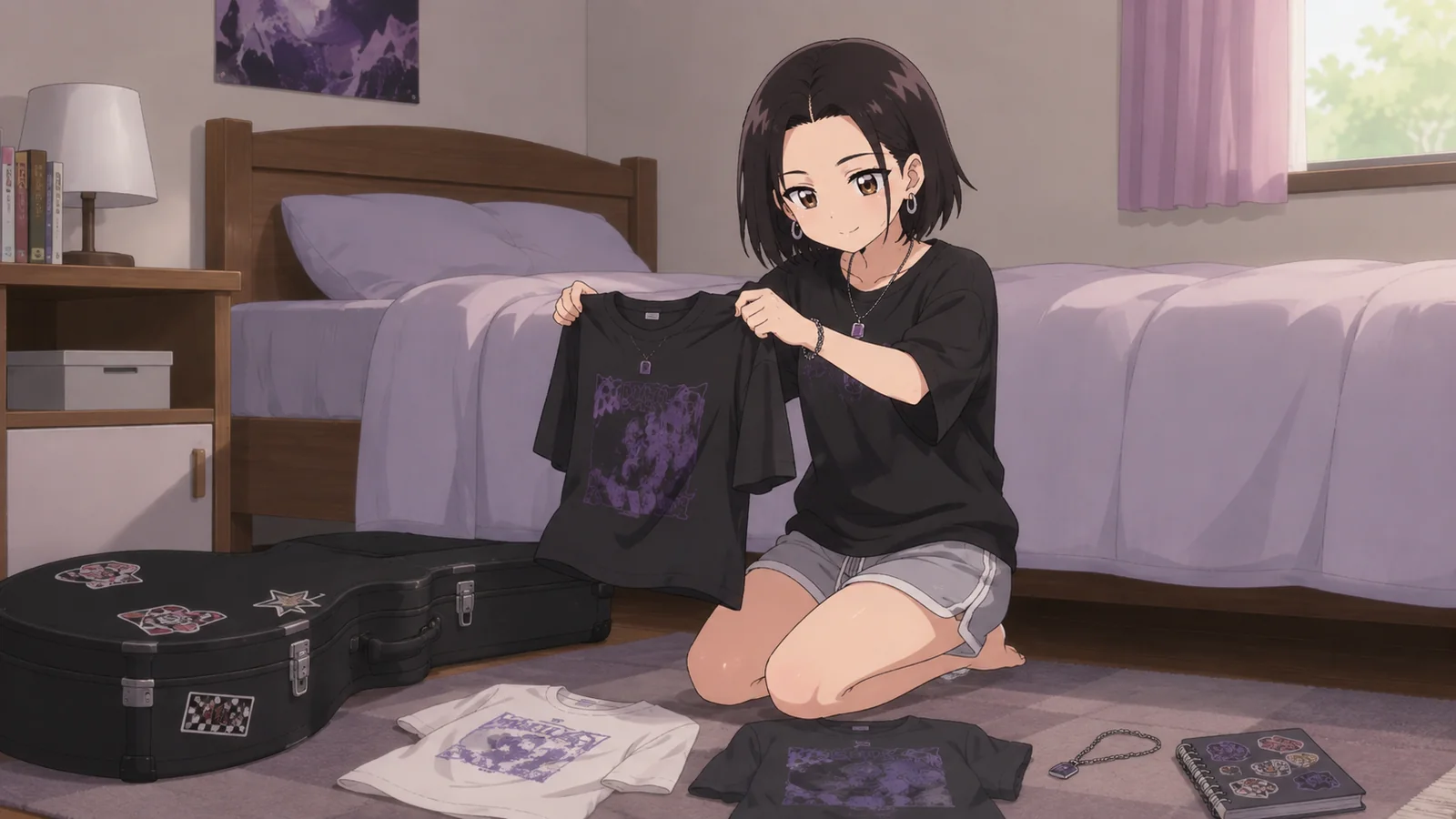
Cute rock is very easy to dress up. And very easy to dress up the same way every time.
Pink doesn’t have to work alone
The best combinations clash a little: pink and asphalt gray, cream and acid green, light blue and dirty red. A cute color benefits from a surface that isn’t trying to be cute.
A pastel background and heavy black typography.
A neat grid and a spontaneous photograph.
A shiny hair clip beside an old guitar.
Stickers, file numbers, timecodes.
Objects build a world
A heart is a symbol. A chipped case is a story. If the visuals consist only of symbols, they become a poster. Objects give you life before and after the shot.
A photo doesn’t have to explain everything
Sometimes the stronger shot comes after the event: an empty chair, a jacket left behind, a blurry photo from a taxi window. Staging things too perfectly quickly turns into a clothing ad.
A good shot knows that life was going on a second before the photo.
Typography
A handwritten font is the obvious move. Sometimes a strict sans serif beside a little silly caption gives you more character. Practical details work well: a date, a demo number, a filename.
Remove the hearts, the pink, and the performer’s face. If the design still looks like this project, there’s a system.